Service Details
Responsive Web Design
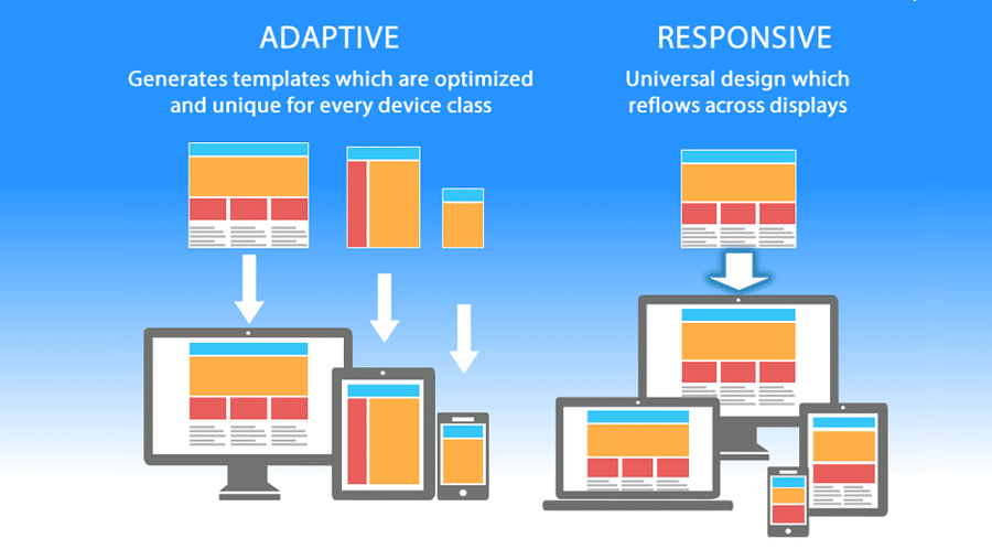
Responsive Web Design
- Mobile-First Development: We adopt a mobile-first approach to ensure that your website is fully optimized for smartphones and tablets, providing a consistent experience across all devices.
- Cross-Browser Compatibility: We test websites across all popular browsers (Chrome, Firefox, Safari, Edge) to ensure that your website looks great and functions perfectly everywhere.
- User Experience Optimization: We focus on improving website speed, reducing bounce rates, and increasing conversions by delivering a seamless and responsive design across all platforms.
Why Choose Us for Web Development?
- Expertise & Experience: Our team has years of experience in web development across various industries and technologies, ensuring that we can handle projects of any size or complexity.
- Tailored Solutions: We create custom solutions that are designed specifically for your business, addressing your unique challenges and requirements.
- Responsive & Scalable: All of our websites are designed to be responsive, meaning they work seamlessly across all devices. We also ensure they are built to scale as your business grows.
- Performance & Speed: We optimize websites for speed, ensuring fast load times and a smooth browsing experience for users, which is essential for SEO and user retention.
- Post-Launch Support: We provide continuous support and maintenance after your website is live, ensuring that it remains secure, up-to-date, and performing at its best.
SUBSCRIBE
SUBSCRIBE FOR NEWSLETTER